ADGEM
AdGem links publishers and advertisers with users who earn money by enagaging with apps, games, and completing tasks.
YEAR
2024
ROLE
UI & UX
Data Analysis
A/B Testing
PROBLEM
Poor conversion rates and confusing flows were holding the app back from it's true earning potential. Users struggled to access important information in an intutive manner and the visual design didn't feel trustworthy.
TEAM
Project Manager - Liam Mohebbi
Full Stack Dev - Robert Anderson
Software Engineer - Maria Cornejo
TOOLS
Figma
DataDog
Jira
PROJECT GOALS
I focused intently on usability and modern aesthetics to increase the trustworthness and usability. KPI's included improving the click-through, conversion, and engagement rates.
RESEARCH
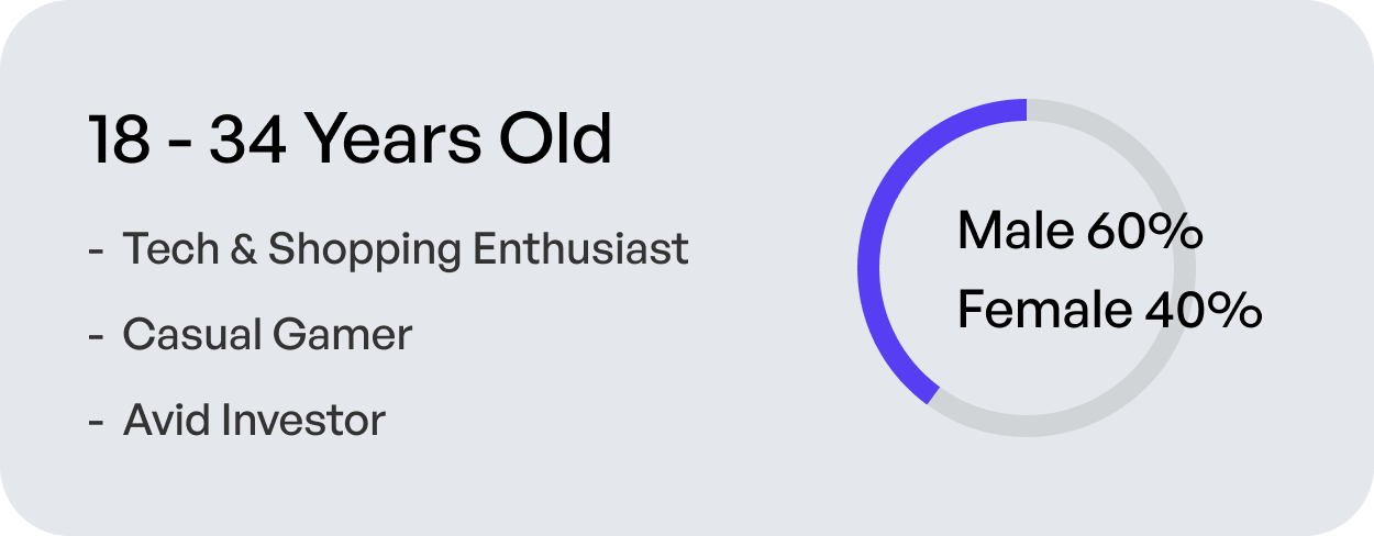
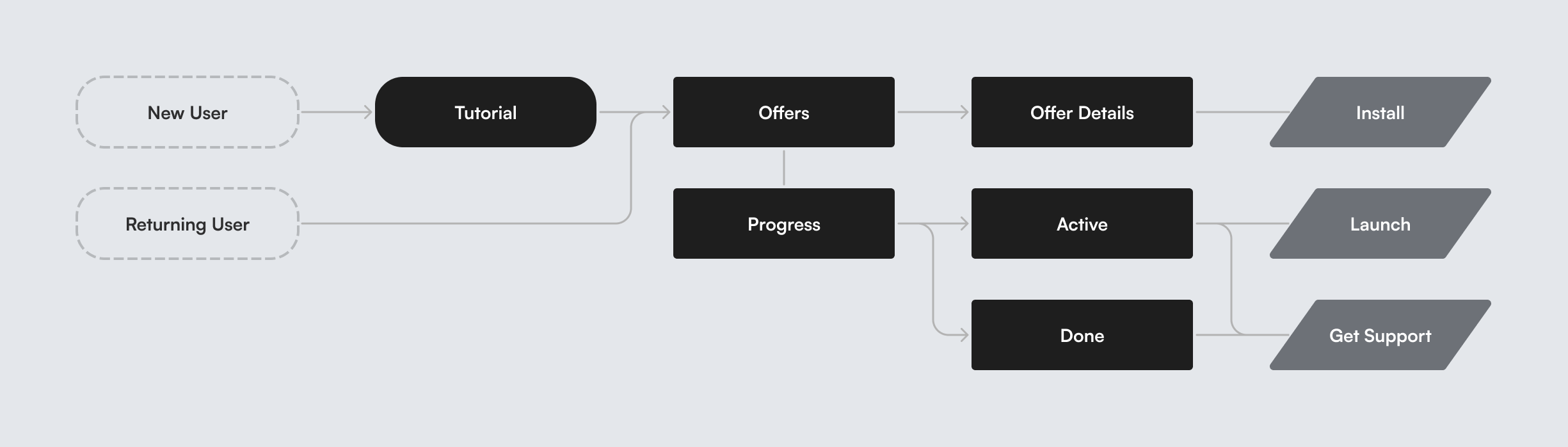
I began this project by identifying our target audience leveraging surveys, interviews, Google Analytics, and Datadog. Stakeholders identified key performance indicators we intended to measure and test. Then I conceptualized new userflows referencing our user pain points and UI/UX best practices.
USER GOALS
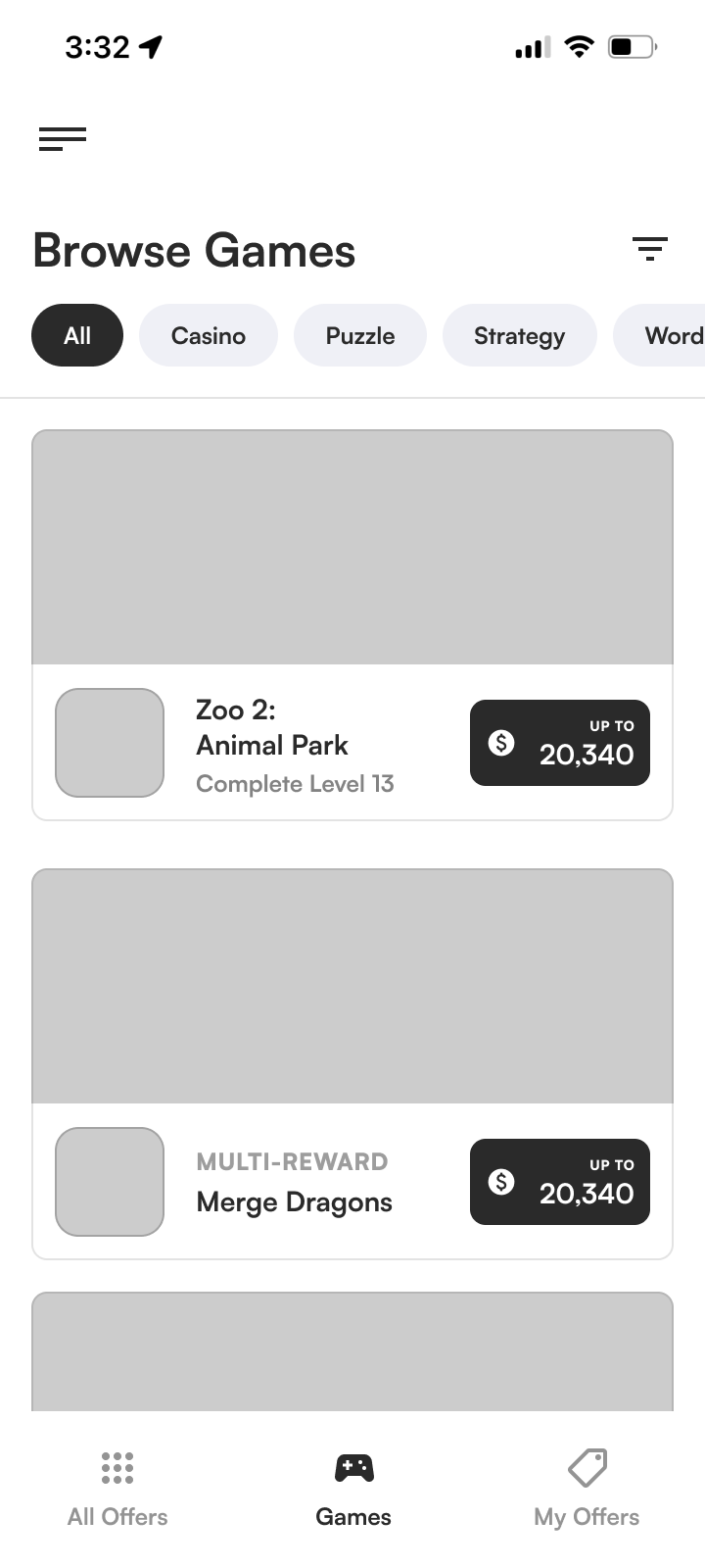
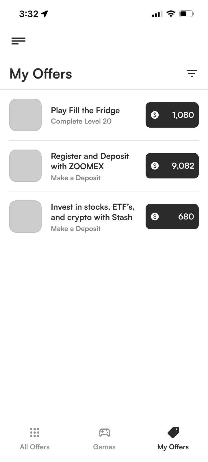
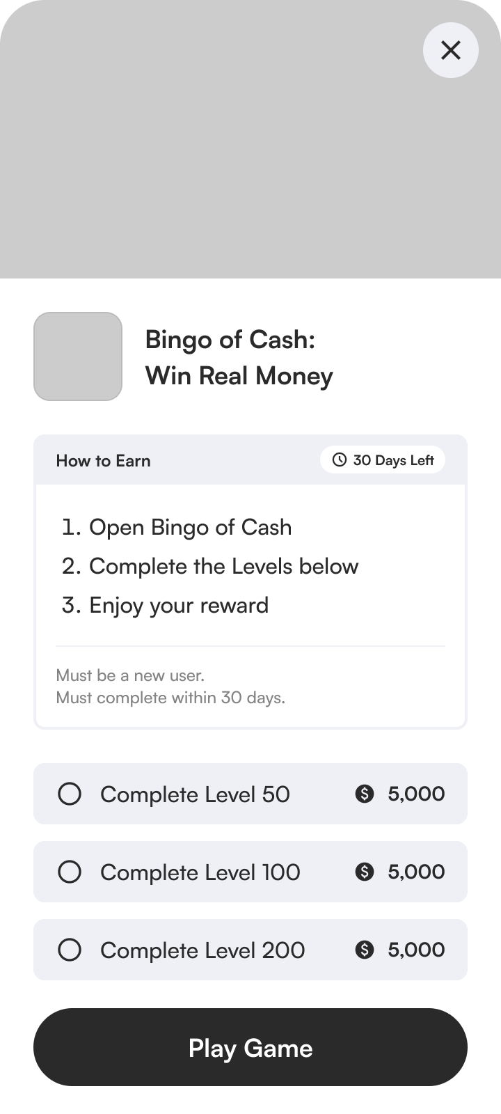
- Get rewards fast
- Browse offers
- Find highest + easiest offers
- Interact with started offers
- Easily get support
BUSINESS GOALS
- Increase conversion rate
- Increase retention rate
- Reduce support tickets
- Increase click-through rate
- Promote exclusive offers
FEELINGS TO EVOKE
- Trustworthy
- Exciting
- Easy to Use
- Fun
- Satisfying
QUESTIONS TO ANSWER
- What is this?
- How do I use this?
- Where do I find..?
- What do I do if I am having issues?
- What are the highest or easiest offers?
UNIQUE CHALLENGES
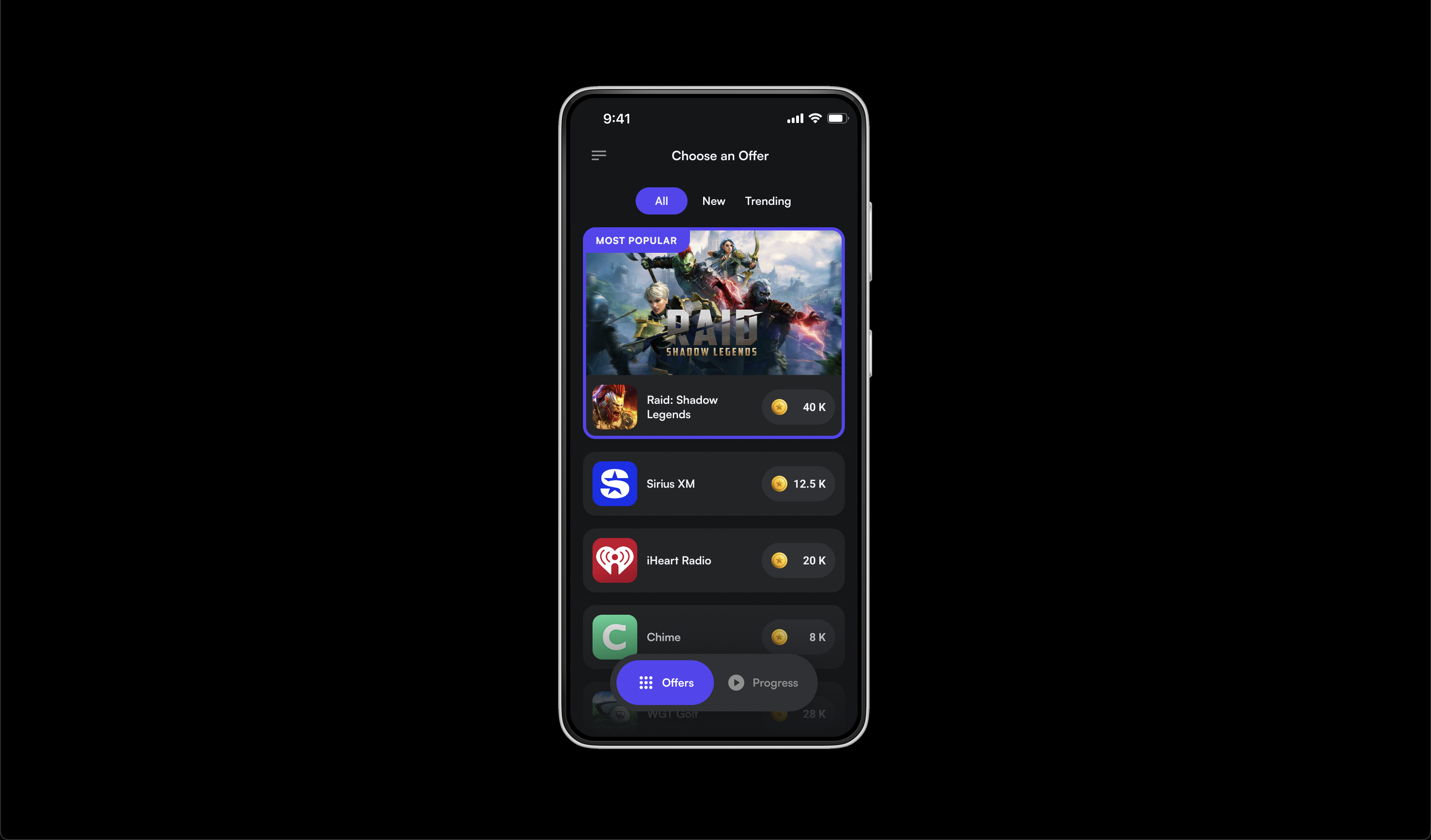
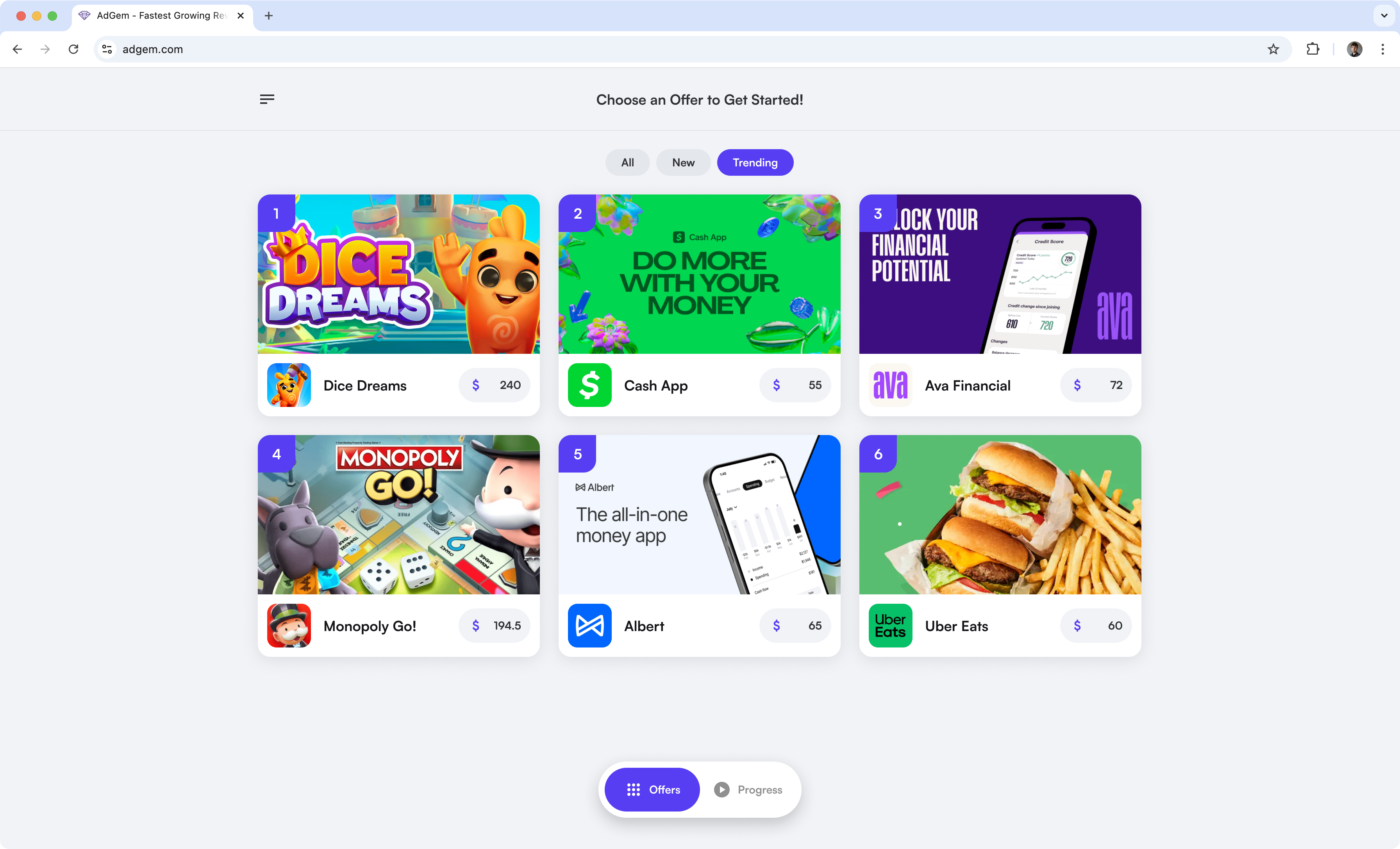
Because our product exists across a variety of platforms and each serves a unique audience, gathering universal user insights was a challenge. For example, AdGem is in gas station rewards apps and personal finance tools. This diversity also brings a wide range of currencies, messaging, and visual styles. As a result, our components needed to be highly flexible and modular to adapt to a variety of circumstances.
IDEATION
After completing the research phase, I developed wireframes and quick prototypes to explore various concepts and user flows. I collaborated with the PM, engineers, and key stakeholders to review the designs and align on a clear initial direction.

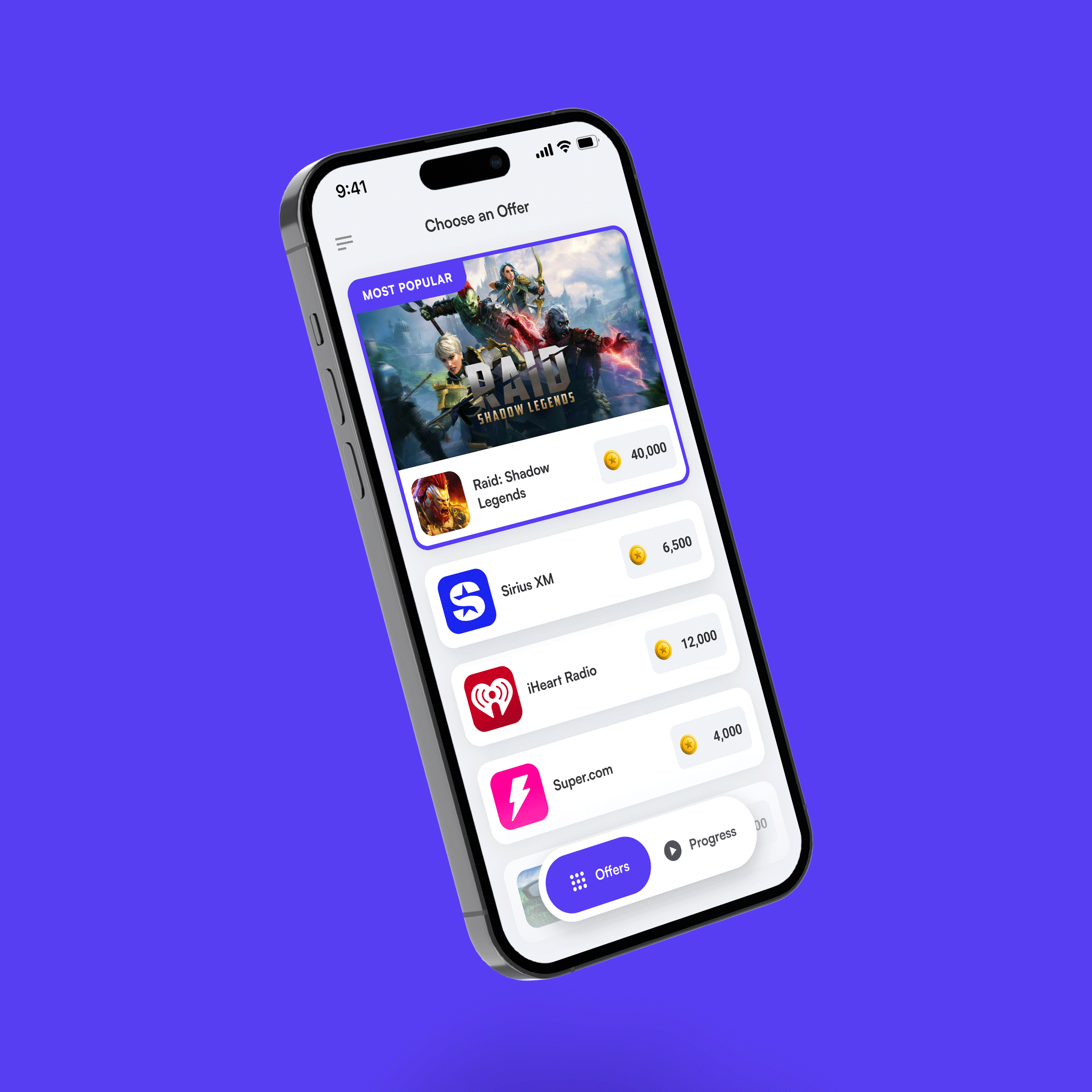
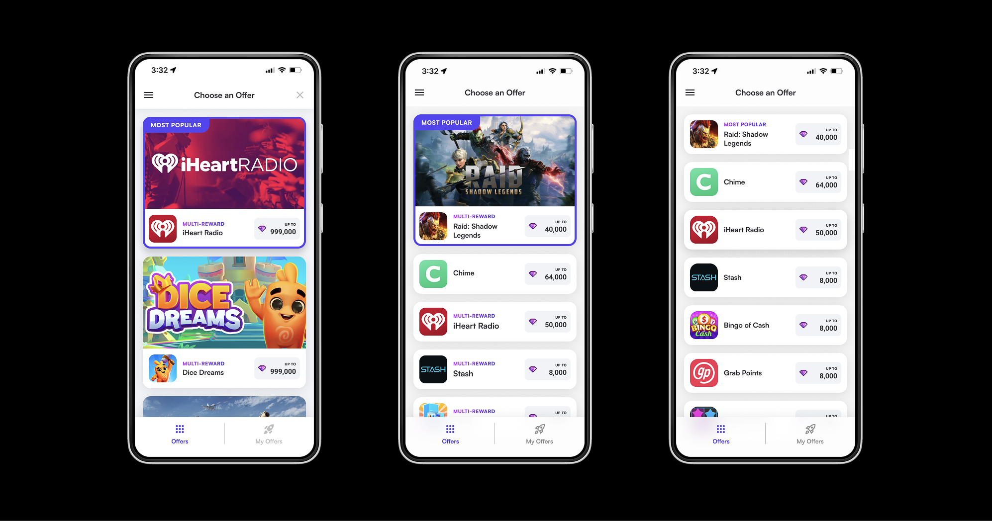
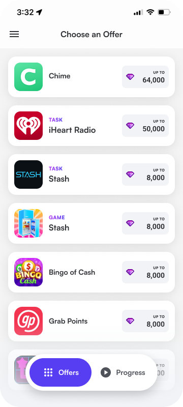
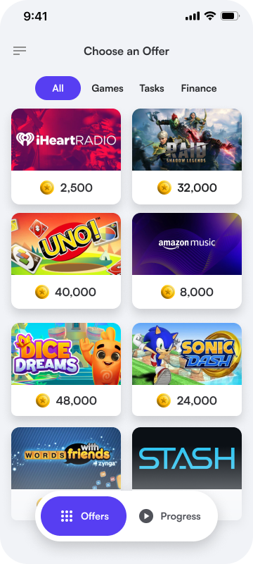
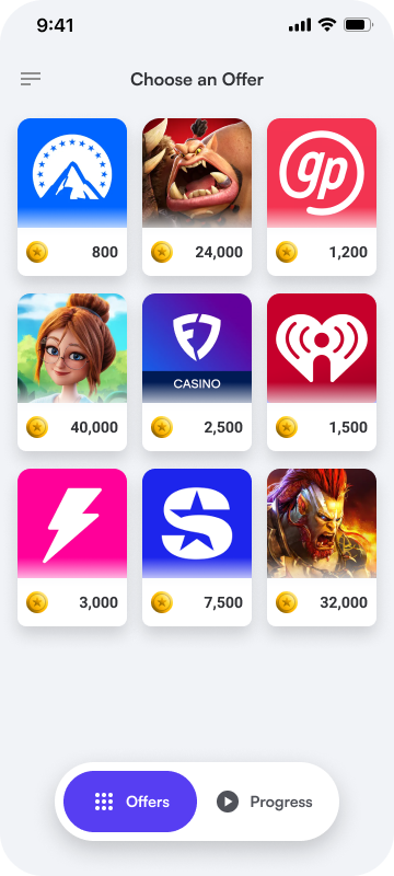
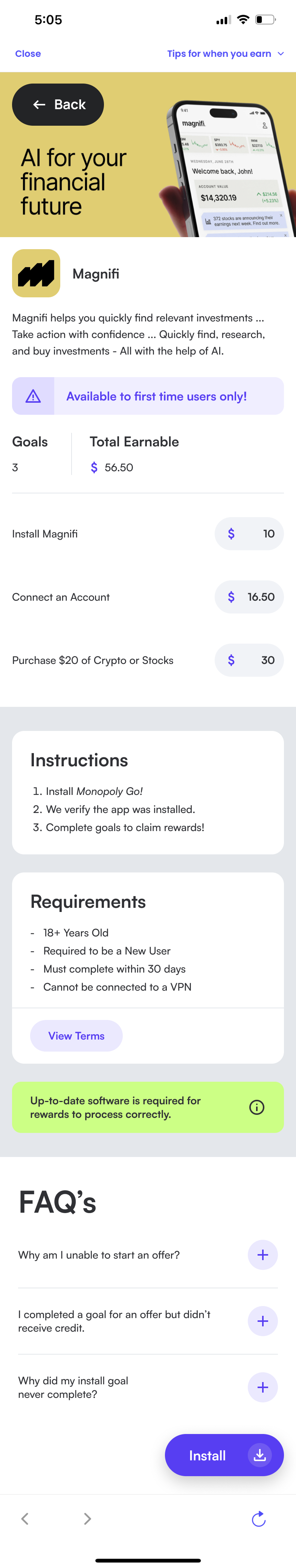
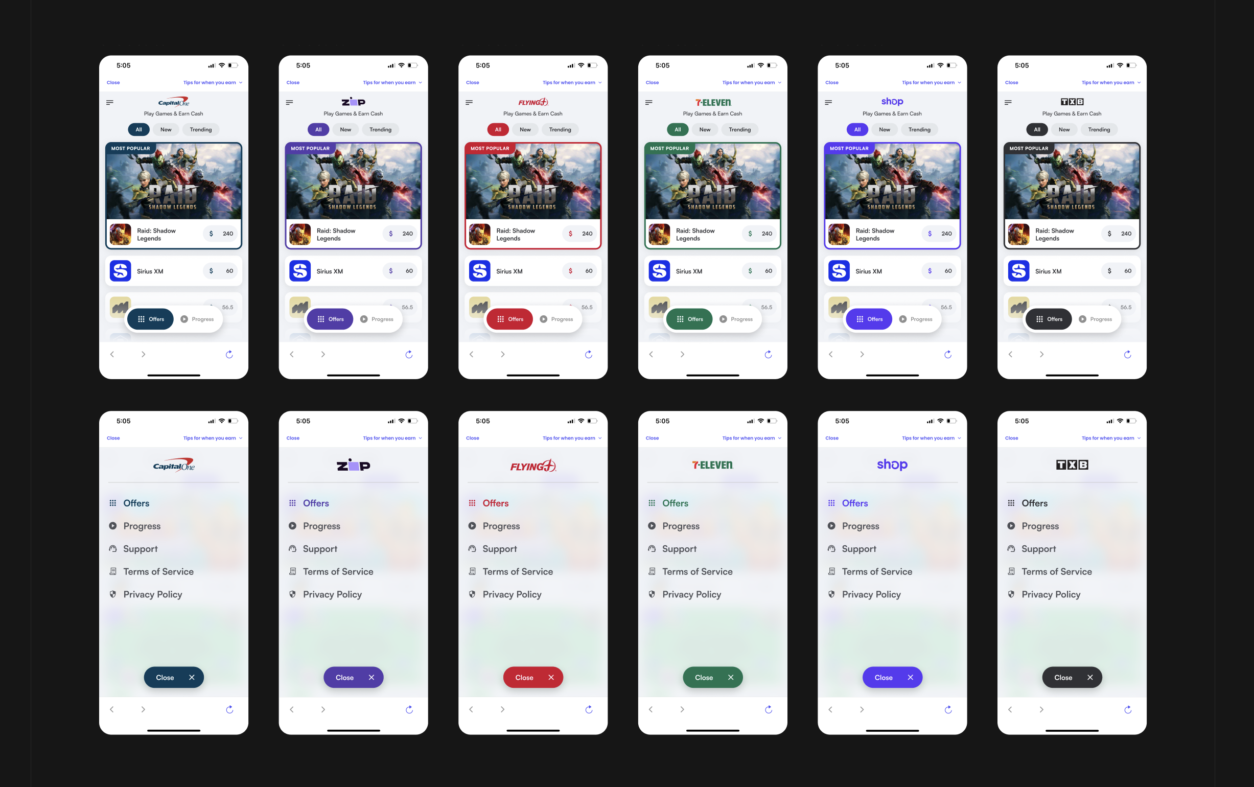
VERSION 1.0
After several reviews I iterated and improved the design until we had a solid V1 ready to head off to the developers to start A/B testing. We focused on speed at this stage and would improve the UX and asethetics one we have some data to work with.
After several reviews I iterated and improved the design until we had a solid V1 to start testing.
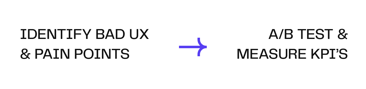
A/B TESTING
We initally shared the new experience with a small portion of our users and began a/b testing different elements. We used specific KPI’s to determine their effectiveness and after a handful of tests we were able to increase our engagement and conversion rates.
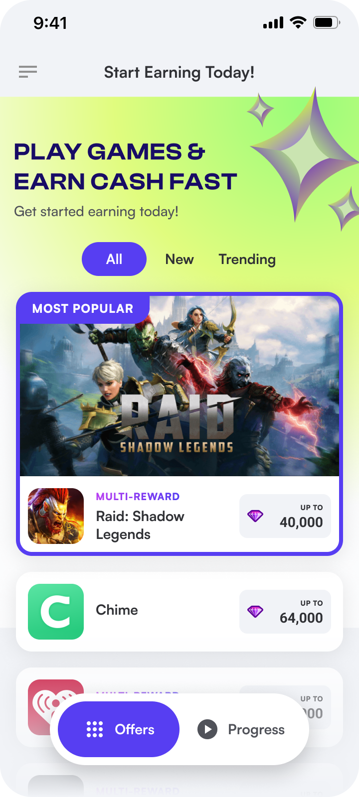
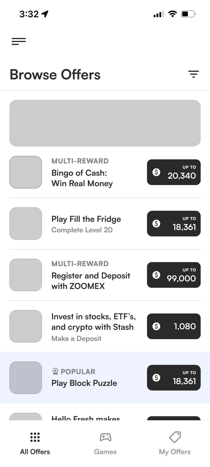
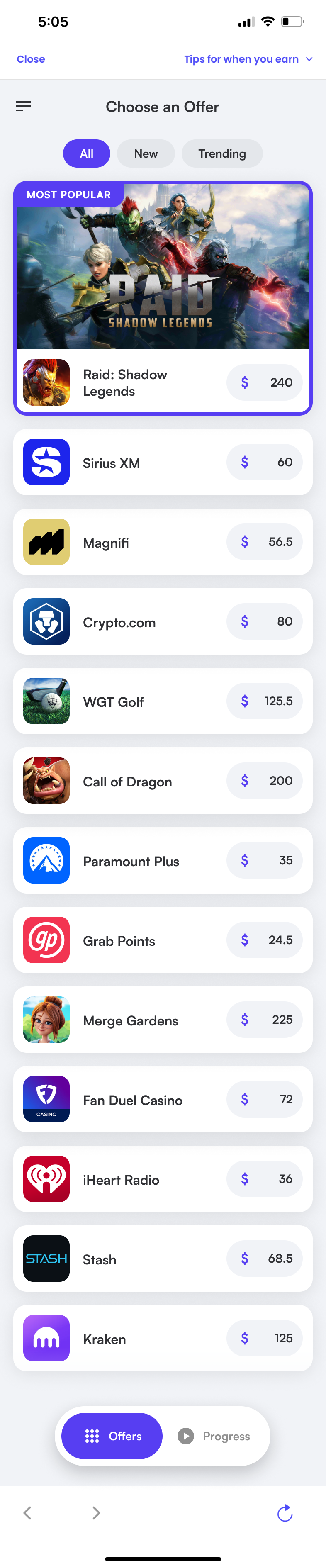
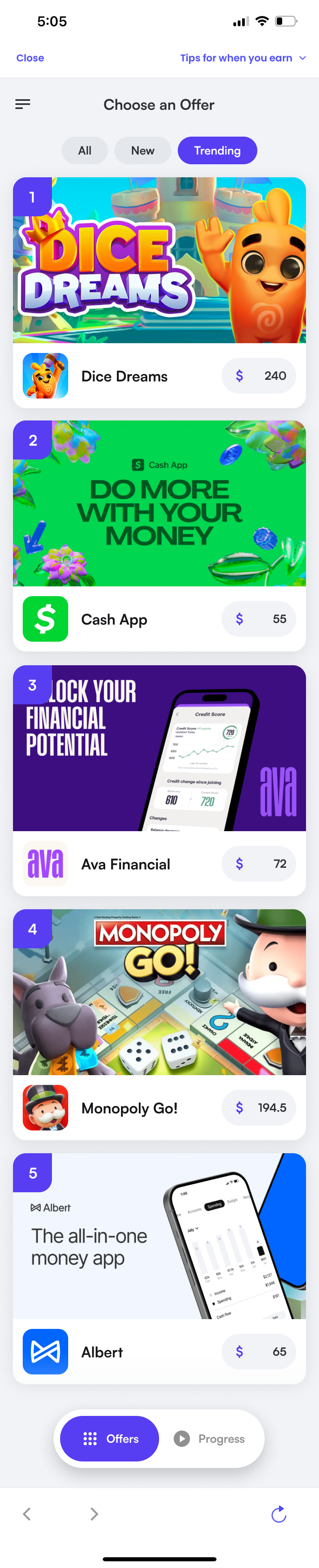
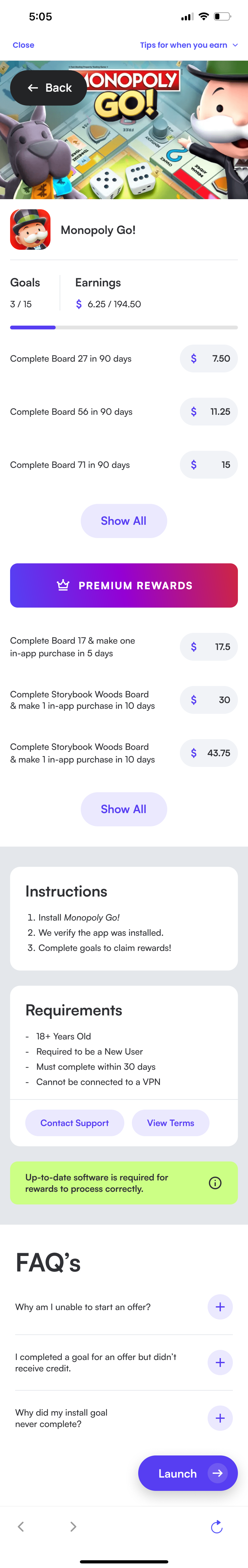
VERSION 2.0
After we gather some intial data we got to see what was resonating with users. At this stage I spent more time improving the UX and visual design so it felt more trustworthy and user friendly.
After several reviews I iterated and improved the design until we had a solid V1 to start testing.
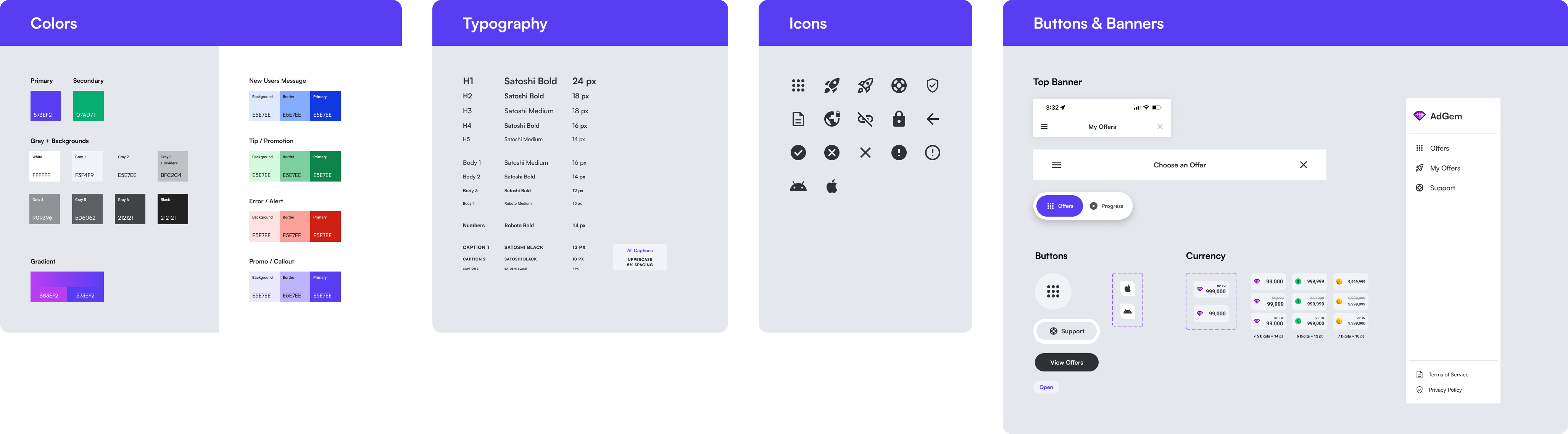
CREATING THE DESIGN SYSTEM
Throughout the design process I created a style guide, components, and design system to establish a consistent visual experience. Doing so helped the developers create a library of components and rapidly develop new features.
OUTCOMES
This project was a major success and helped us record our highest day of revenue ever.
During this project I learned the importance of clear collaboration with the developers to make sure our vision is aligned and how vital it is to have data recorded properly to make informed decisions.
Higher priorities on the dev team lead to some bottle neck issues and we weren't as fast at iterating and updating the product as we had been at the start. Gathering useful and accurate data was also a big challenge in the beginning.
Conversion Rate
+ 15%
Quaterly Revenue
+ 33%
Click Through Rate
+ 45%
Bounce Rate